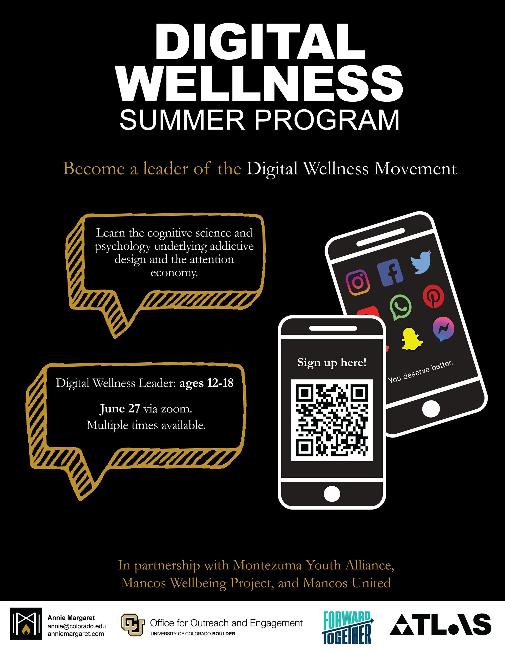
Digital Wellness Summer Program
Tools: Adobe Illustrator
Created: June 2022
This poster is for the Digital Wellness Summer Program taking place through the Office for Outreach and Engagement at CU Boulder. When speaking with my client, I was given the description information and told to create a poster that would be interesting for teenagers.
I went with the given color palette of white, black, and orange. From there I created some orange chat boxes to put the information in. I drew out some phones and put in one of the previous project images and added in a QR code for the online form.
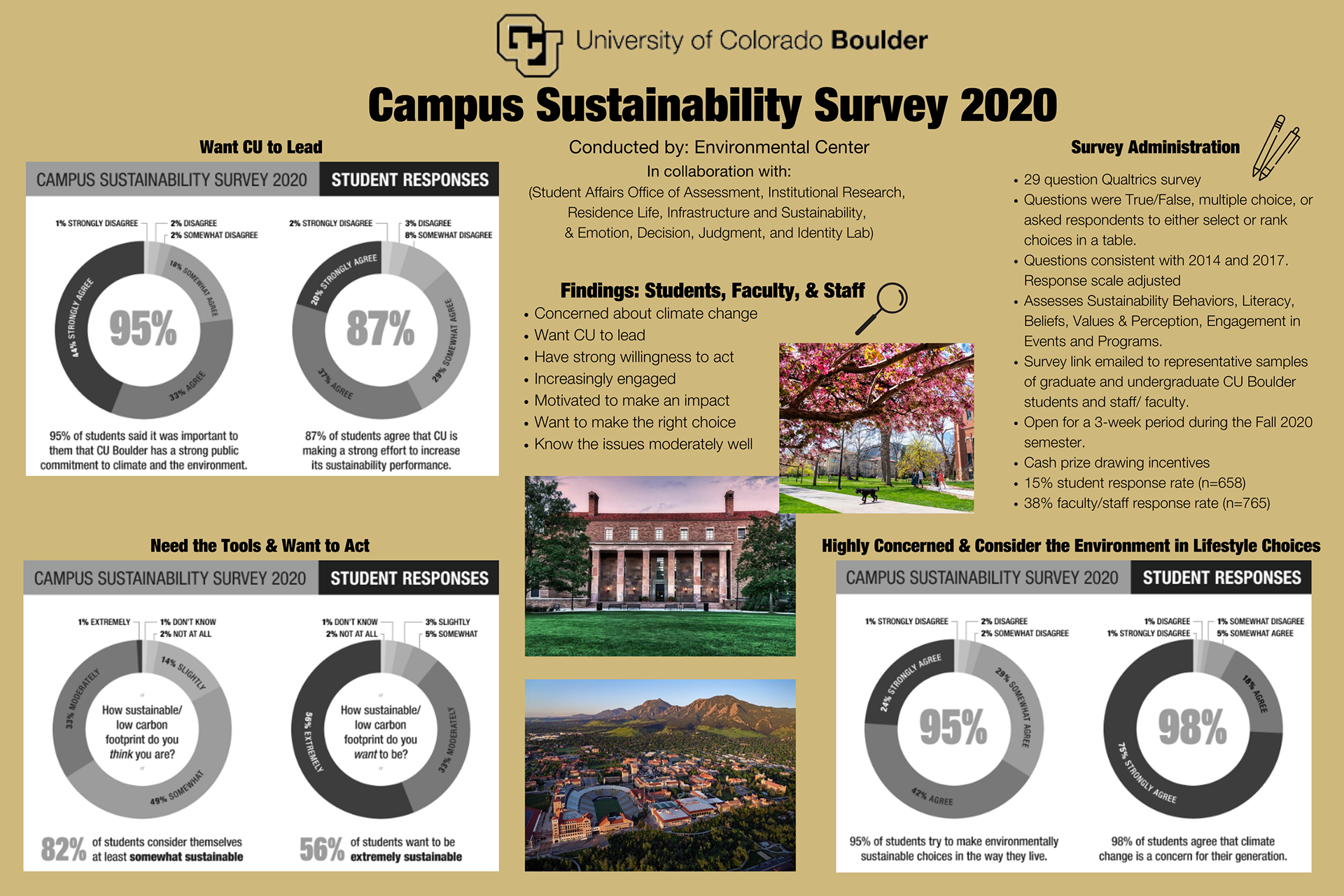
CU Boulder Campus Sustainability Poster
Tools: Canva
Created: April 2022
For this design, I was tasked with creating a conference poster based on information I was given by my client. My client wanted the data graphs to be black and white, and she wanted some pictures of campus included in the design.
I used the traditional CU Boulder colors, since this poster was for a sustainability conference and described how CU Boulder was doing in regard to sustainability.
I laid out the most important information on top and structured all my other information from there. I decided to have the information in bullet points for easier reading and included small visual aids to give the audience a heads up on what information they would be looking at.
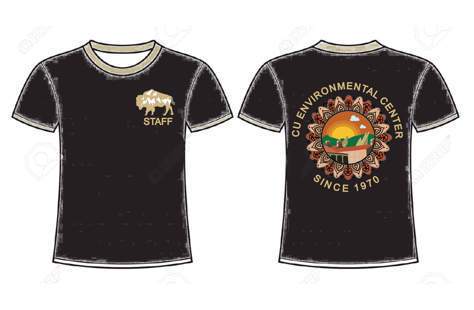
CU Boulder Environmental Center Shirts
Tools: Adobe Illustrator
Created: March 2022
This design gave me the opportunity to create illustrations for a shirt for the staff at CU Boulder's Environmental Center. I wanted the shirt to be as unique and wonderful as the center.
After tons of feedback, this is the final result. I worked with one other student on this project, and he made the illustrations on the flower petals.
For the shirt, we decided to use school colors (black and gold). We wanted to include our mascot, a buffalo, on the front pocket of the shirt as well as the name "STAFF".
For the back we included the name of the center as well as the year it was founded. The illustration within the flower petals is the UMC building on campus where the center is located. I made sure to include the famous Flatirons in the back as well as a warm sunset to show the welcoming atmosphere of the center and the amount of care we have for the nature around us.
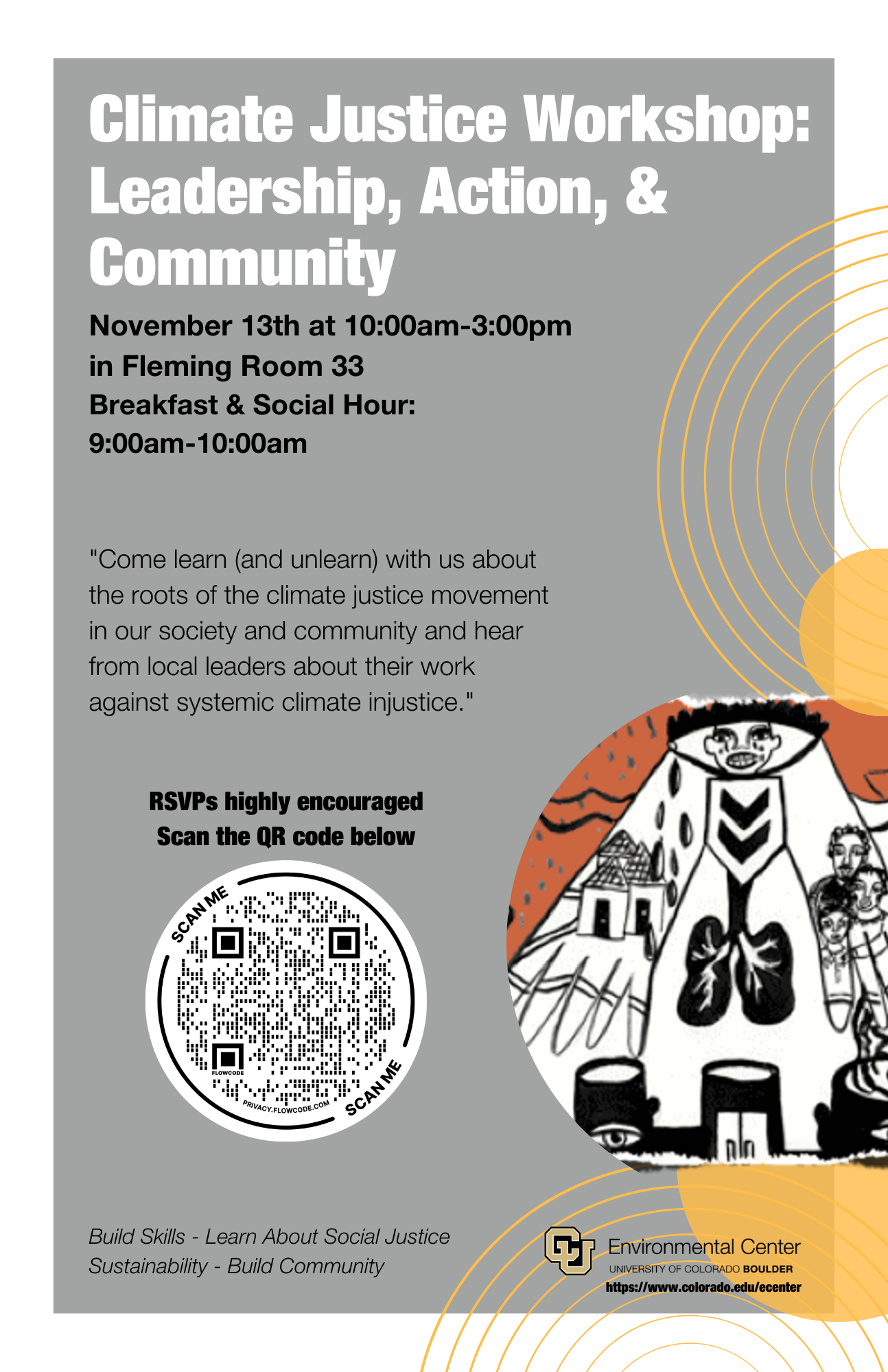
Climate Justice Workshop Poster
Tools: Canva
Created: November 2021
For this design, I was provided some simple images of what my client was going for. From there I decided on a color pallet. I would use white, grey, black, and yellow within the design. I used these colors to create a serious but happy and hopeful tone.
From the descriptors given by my client, I started to think of what the design could look like. Ultimately, I came up with the idea to use overlapping circles to create a feel of community and collaboration.
I laid out all of the circles and decided to include one of the provided images to help identify one of the communities affected by climate injustice.
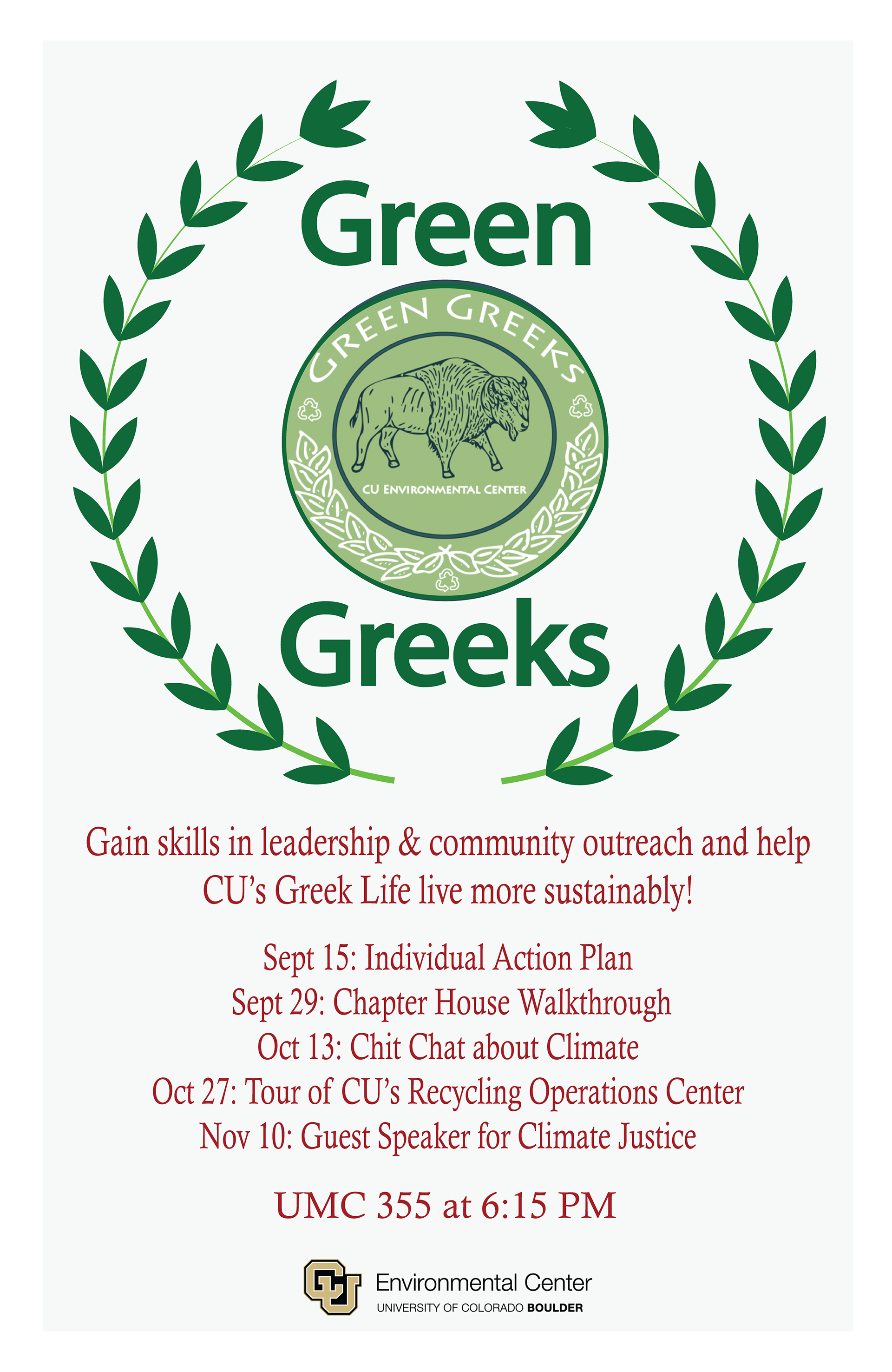
Green Greeks Meeting Poster
Tools: Adobe Illustrator
Created: October 2021
This poster was created for the Green Greeks club on CU Boulder's campus. When discussing design thoughts with my client, my client said that they wanted a simple design, with an off-white background, and descriptions they would supply me.
When thinking of other colors to use, I ultimately decided to have green branches circling the club logo. From there I just needed to decide what color font I would use for the descriptions.
I choose red because red draws attention and also creates a sense of urgency. The red also fits the design because the original Greeks enjoyed wine and often had red in their designs. I wanted to make a simple hint to Greek culture by including this.
Abstract Waves of Space
Tools: Adobe Illustrator
Created: September 2021
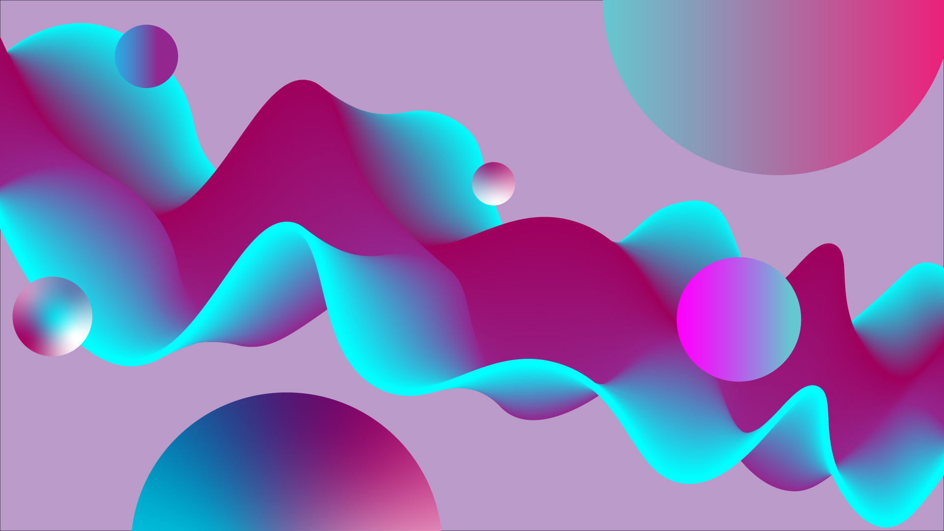
With this design, I wanted to play around with fluidity and how liquid looks in space. In space liquid is much more of a solid, so I played with this looks in the waves I created. The spheres represent different planets and space matter.
I decided to use light blues and pinks because these colors emotionally mean playfulness, freedom, and self-expression.
The Blues of Nature
Tools: Adobe Illustrator
Created: September 2021
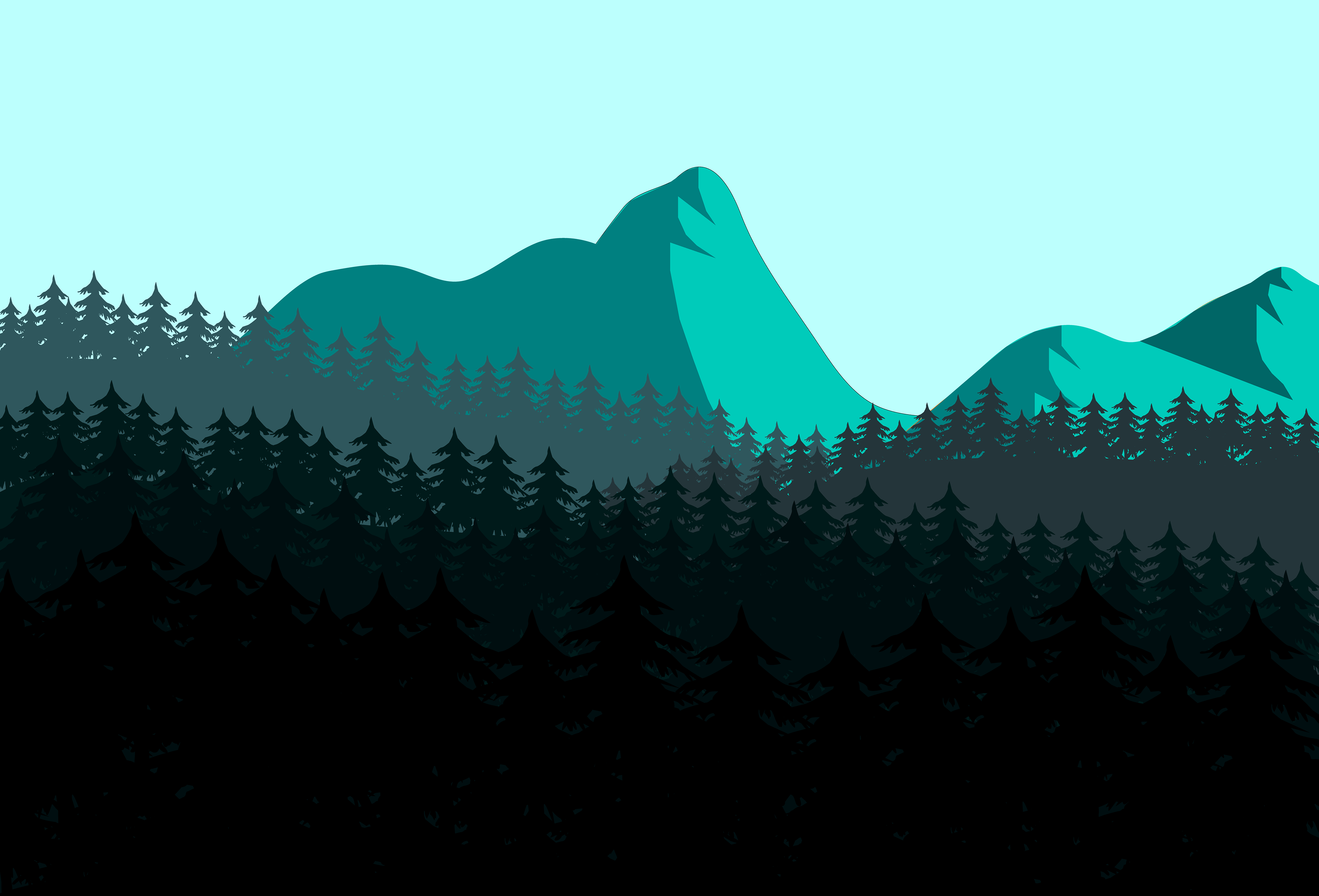
Nature has an extraordinary way of displaying colors, and that inspired me to create my first nature vector piece within Adobe Illustrator. In this design, I really focused on creating a piece focused on the color blue. I wanted to take example of blue in nature, such as blue spruce trees, and really play with a landscape that had a color palette of varying blues.
I began in the back and moved forward. I created the mountains using vectors and applied varying blues to produce the direction of light within the piece. From there I created many vector hills in front of my mountain pieces. I used a stock image of a pine tree and produced many copies to create the look and feel of a forest. With each layer of trees, I varied the color and sizes to produce perspective within the art.
Percy Suchanek Personal Logo
Tools: Adobe Illustrator
Created: July 2019
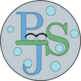
With this design, I aimed to create a logo that really represented my personality. I wanted my audience to get a hint of who I am without having ever spoken to me.
I started the design by figuring out where my first, middle, and last initial would connect to each other. Once I figured out the placement, I brainstormed the other elements I would include. As someone who has been wearing glasses since elementary school, I really felt that they had become a strong part of my identity, and this made me really want to include glasses within the design. Due to my fun loving, not too serious nature I decided to create the glasses in a low-poly format. After this I began to think of adjectives people have used to describe me such as: bubbly, giggly, silly, sweet, kind, etc. I felt that including bubbles in my design really emphasized and empowered the adjectives often used to describe myself.
Finally, I had to think about the color scheme. I used black on the glasses to represent a more accurate version of my frames. I enjoy the colors blue and green, so I made my letters soft shades of green and blue. I added in turquoise for the bubbles to diversify my logo further and to really bring out the elements of the bubbles to my audience. I needed a nice neutral color for my background that would not interfere with the brighter shades of the bubbles; I used gray because it helped the bubbles stand out much more than a white background. In addition, the gray also balanced well with the other shades of blue and green within my piece.
Times New Roman Poster
Tools: Adobe Illustrator
Created: July 2019
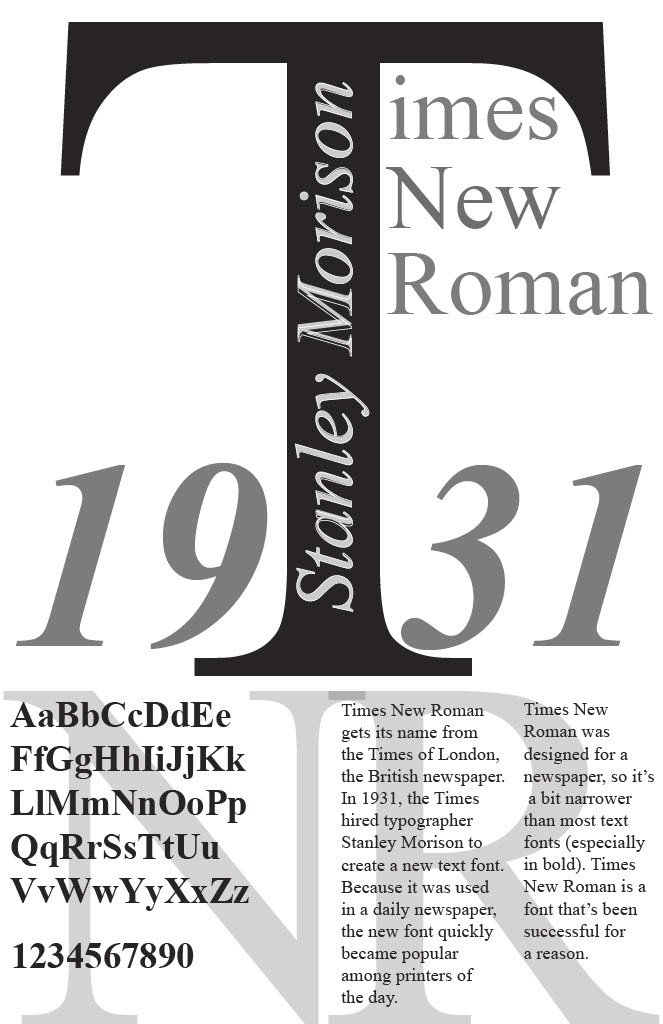
With this design, I decided to choose a font and create a poster for it. The font I chose was Times New Roman. I stuck with a black, grey, and white color palette due to the classic nature and feel of Times New Roman.
I decided to show the alphabet as well as numbers, to give the audience a full glimpse of the font. I also included a short description, so that people could actually learn about the font.
I decided to put the "T" in the middle to create symmetry and balance within the poster. I added the "N" and "R" in underneath all the descriptors to better fill the page and create this shadow appearance.
I made sure to give plenty of credit to the typographer that created Times New Roman by adding him in both the design as well as the description. I wanted to incorporate other elements into the "T" to really show the impact Times New Roman has had on typography. I did this by having the "T" split the time and be much bigger than the rest of the name.
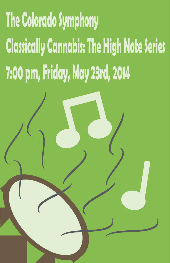
Classically Cannabis Poster Concept
Tools: Adobe Illustrator
Created: June 2019
With this poster, I wanted to play with the foreground and background to symbolize the "trippy" effect drugs can have on the mind. I accomplished this by blending the drum on the bottom corner into the background color of the poster.
I used green, brown, and white as my color scheme. These colors are already associated with cannabis, so I wanted to make a poster that would easily catch the eye of someone who is a cannabis user.
Colorado Symphony Poster Concept
Tools: Adobe Illustrator
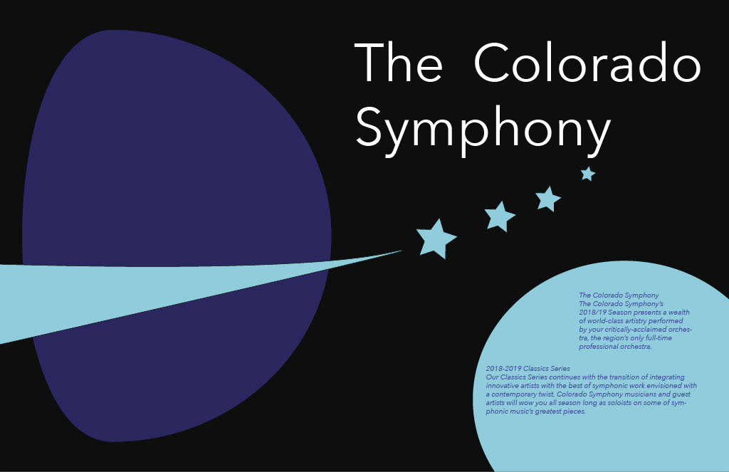
Created: June 2019
With this poster, I began by brainstorming what people may feel when listening to a symphony. I thought of descriptors such as: another world, drifting, exploration, etc.
From here I was able to come up with the concept of space exploration. I felt that this would be especially unique because there are no sound waves in space. I decided to go from a color scheme of blues because blue has a calming and relaxing effect on our psyche. I created the star trail as a way to represent a plant ring as well as led the audience to the title at the top.