Introduction:
Duration: August 2021 - December 2021
Roles: Researcher, Designer
Tools: Figma, Adobe Illustrator
Summary:
Chipet is a thrifting app for all parents alike!
Whether they have furbabies and/or children, this app provides a place for them to thrift and sell items while contributing to more ecofriendly attitudes through the exchange of used items.
By creating an app that is geared towards children and pet items, parents can have a one stop shop for all their "kid's" needs without spending a fortune.
Problem:
There are very few apps dedicated to thrifting, especially in regard to a specific audience.
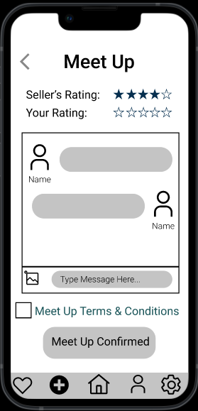
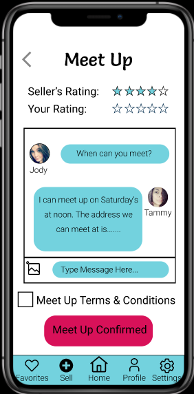
In addition, through research I found a major pain point to be meetup protections. This gave me a big challenge to think through because I found no other application that had this feature.
Research:
Background:
This research study is to support the development of my app, Chipet, and to learn more about how customers associate second hand items of children and pets.
Goals:
Discover customer habits around children and pet items, learn about current pain points of getting/giving away children and pet items, and learn more about customers' mental models for selling and/or buying children and pet items.
Sample Interview Questions:
~"Where do you go for secondhand items whether it be selling or buying?"
~"Do you have children's or pet's items at home that you don't use? Do you want to get rid of them?"
~"What is your process when selling an item online?"
~"How do you decide to buy a secondhand item online?"
Methodology:
This will be a 1:1 interview consisting of 7 participants. Each participant session will last 30 minutes. Interviews will happen over the phone with a list of pre-screened candidates.
Participant Screening:
Age range 21-60
Household Income > $50k/annual
Must have children, grandchildren, pets, or used to have
Must have thrifted or sold before
Affinity Mapping:
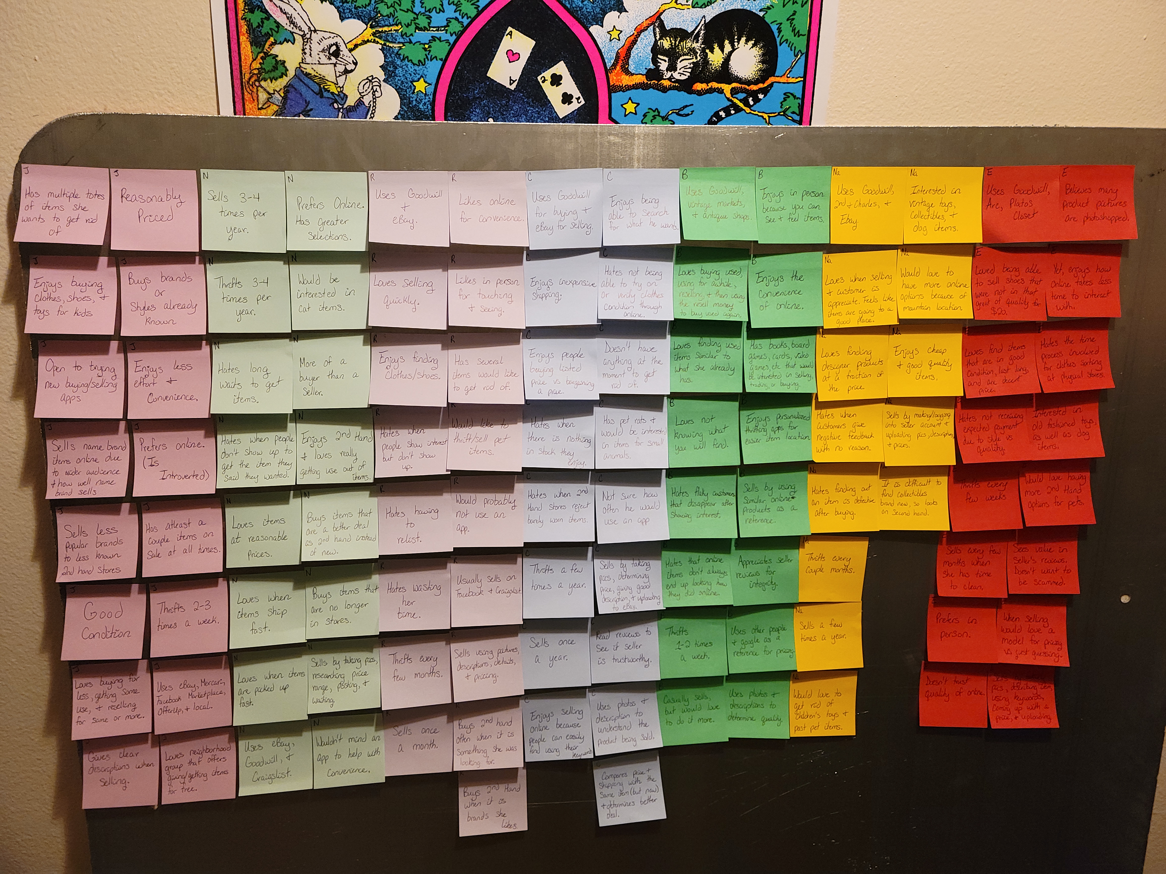
Organized by interviewee.
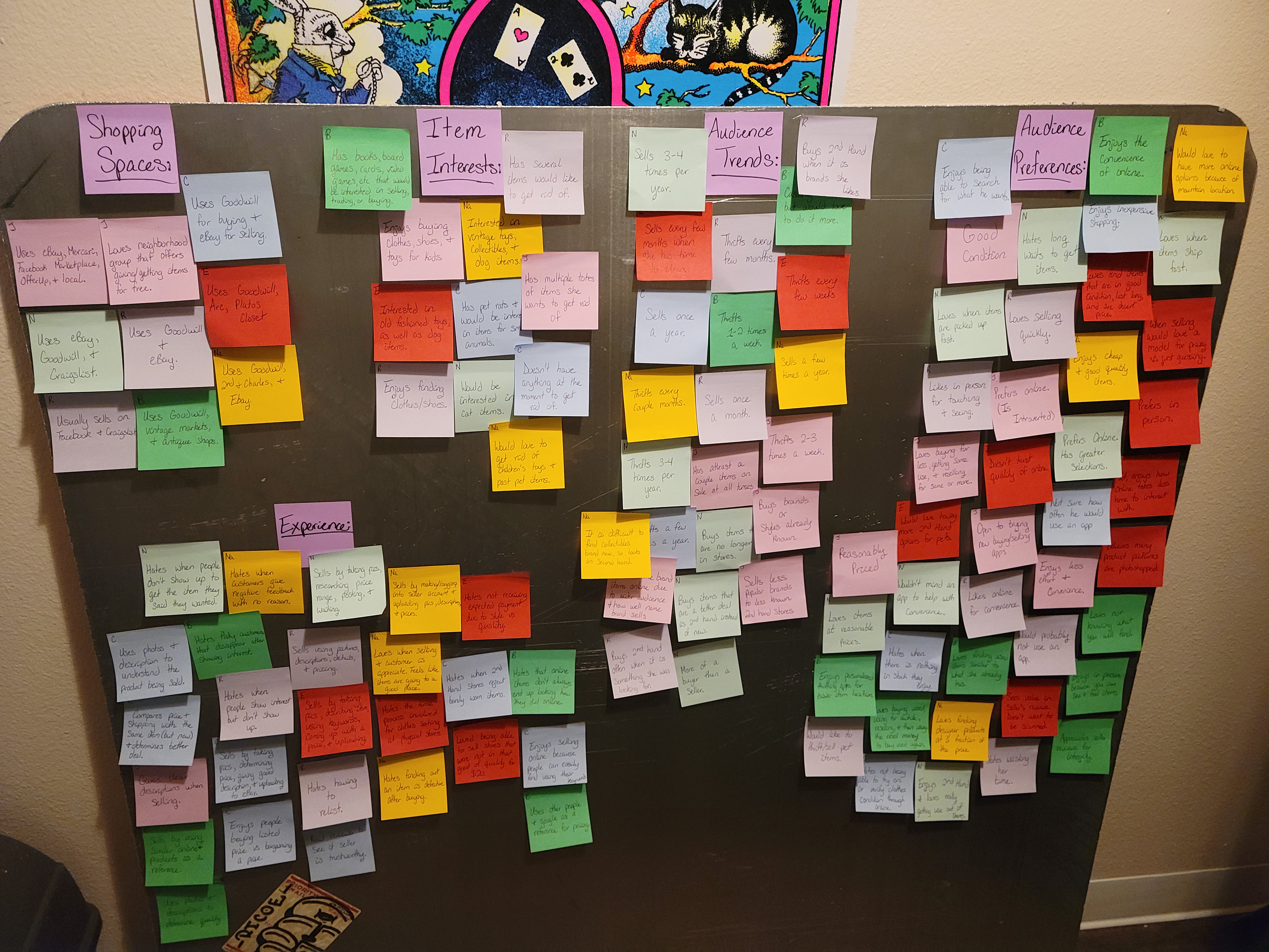
Organized by topic.
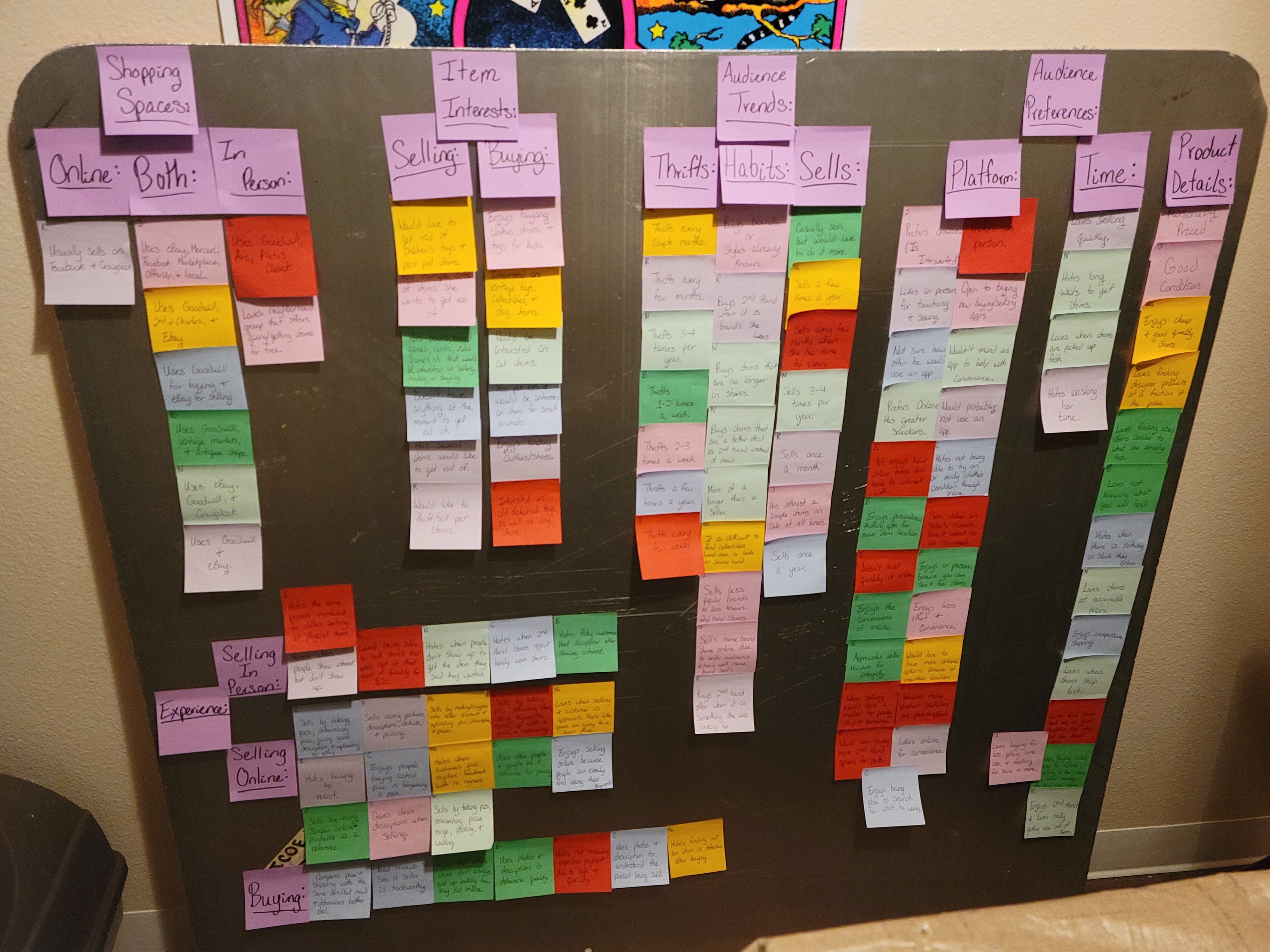
Organized by topic and subtopic.
Interview Findings & Analysis:
~Meetup protections were mentioned in multiple interviews. Many interviewees explained that they had been in a situation where a meetup was agreed on, but one party did not show.
~Most interviewees agreed that online shopping is more convenient, but you miss out on the physical aspects of shopping.
~Multiple interviewees mentioned that shopping online gives more variety and makes it easier to find specific items that they are interested in.
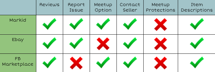
Competitive Analysis:
Through comparing three different online thrift options, I found that none of the existing applications offer meetup protections. Due to this, I knew that this feature would make Chipet unique and would also provide the solution to the major pain point of having an unsatisfactory meetup.
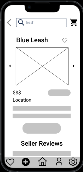
In addition, this competitive analysis also helped clarify other features I should include such as reviews and item descriptions because all three applications were successful in using these.
How might we?
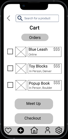
How might we develop a thrift experience that incorporates the successful features of previous applications while also addressing the major pain point of meetup protections?
Design:
Problem Statement:
Many people, especially parents, have begun thrifting online due to convenience and item variety that they cannot receive in a physical location. Yet, many online thrifters face trouble when it comes to physical meetups for items. Often one party decides not to show and leaves the other party feeling upset and that their time has been wasted.
User Flow:
Through this process, I evaluated my golden path and the variety of steps a user could take within each part of the golden path. These flows would help me later in creating my wireframes for Chipet.
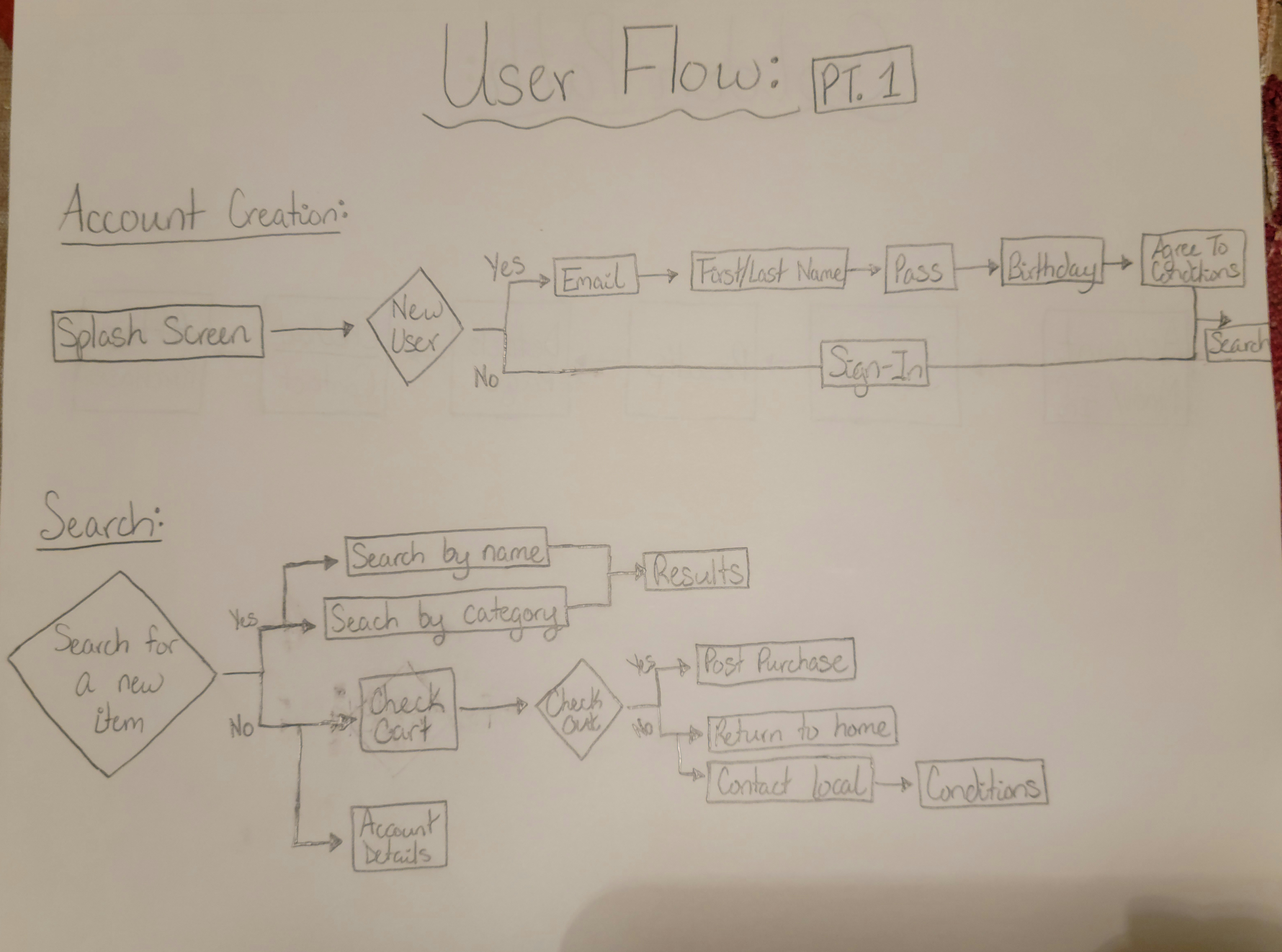
User Flow Part 1: Account Creation and Search
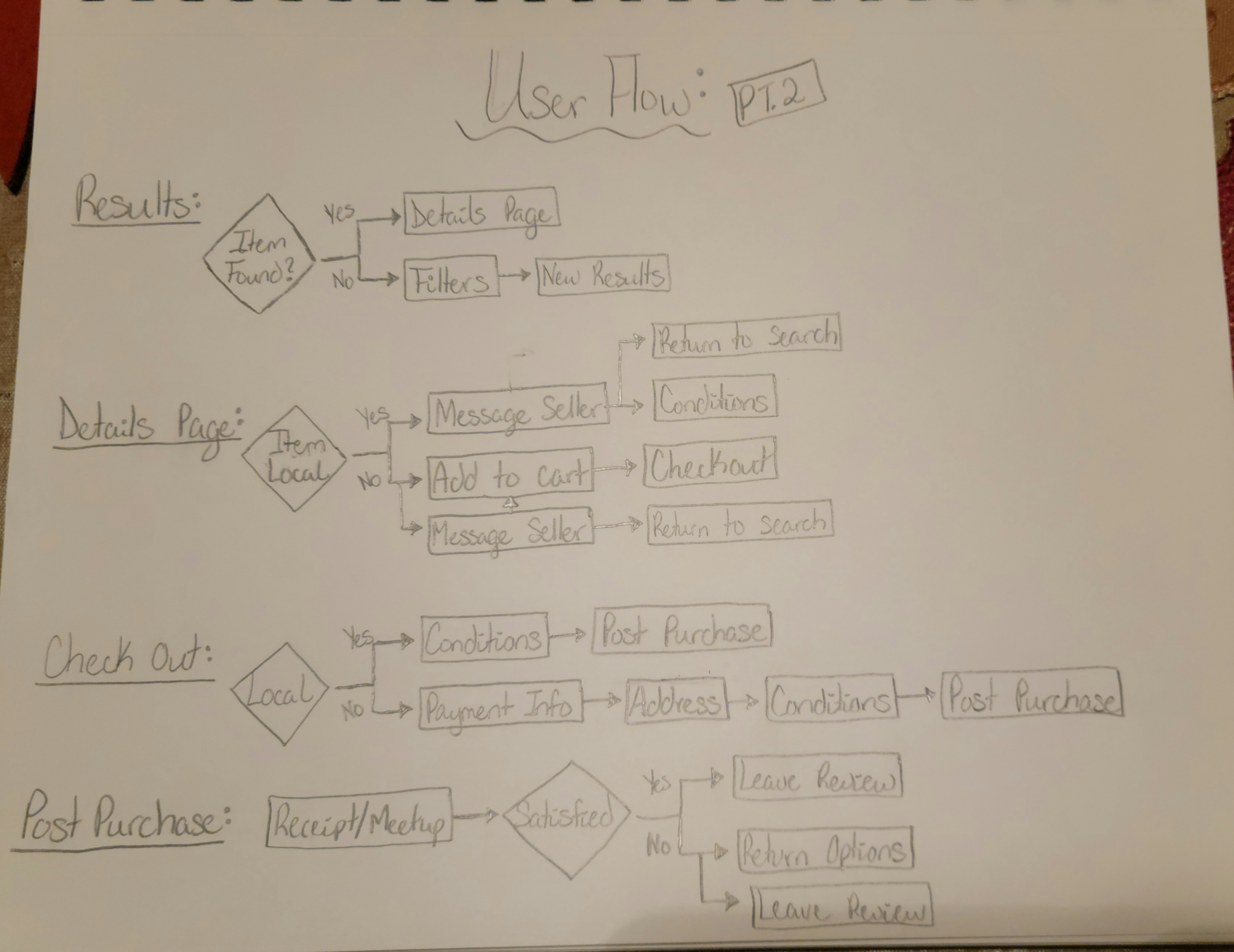
User Flow Part 2: Results, Details Page, Checkout, and Post Purchase
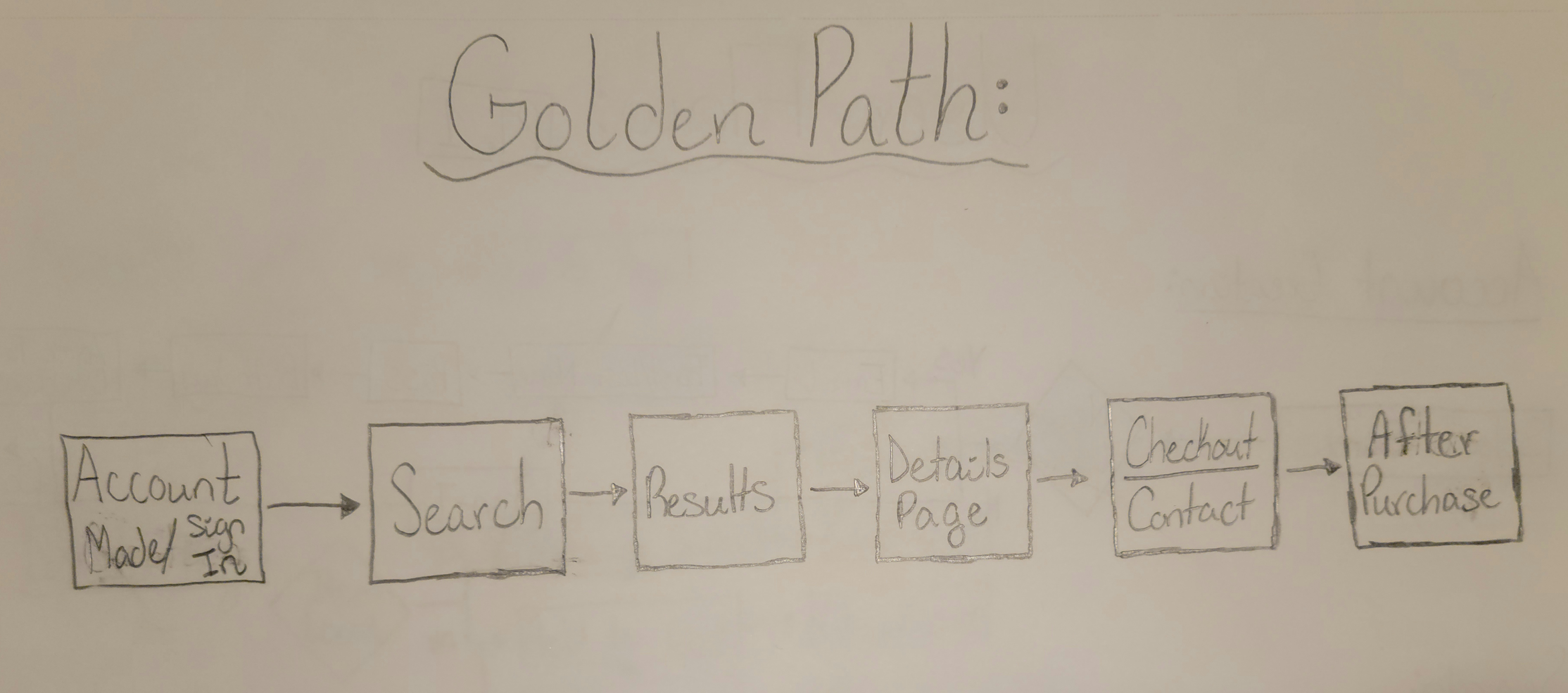
Golden Path
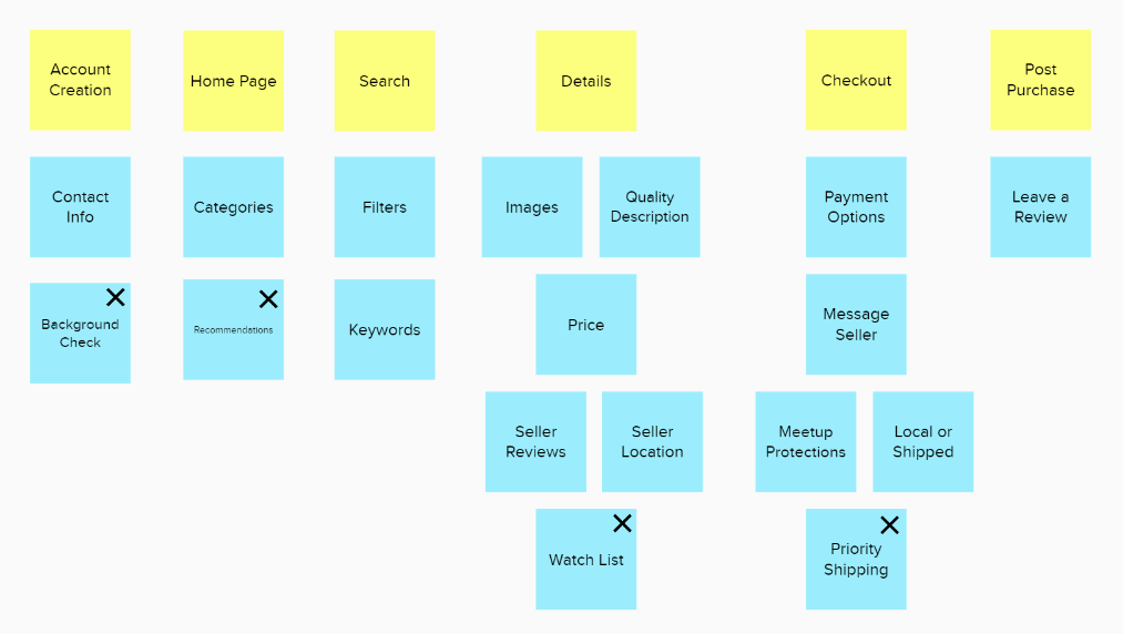
Feature Prioritization:
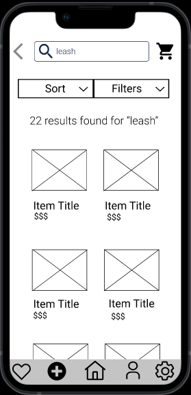
After thinking through the user flow, I examined each part of my golden path and figured out which features were needed, and which features could be included in later iterations. My MVP features are those that do not have an "X" on them.
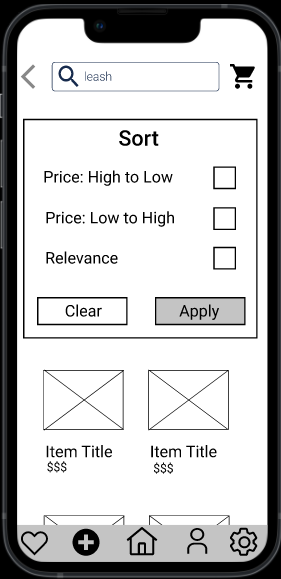
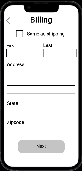
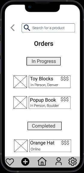
Medium Fidelity Wireframes:
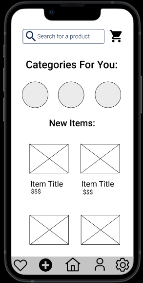
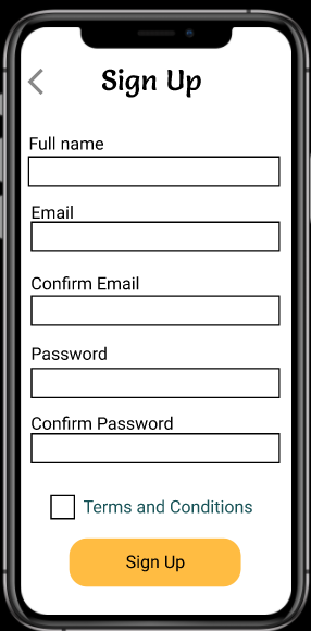
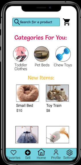
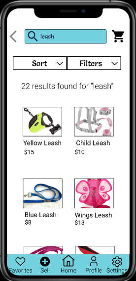
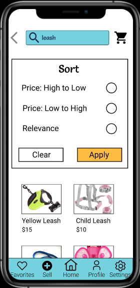
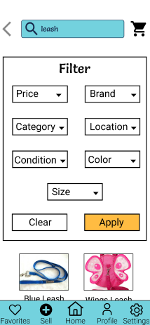
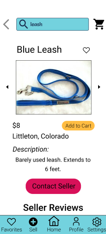
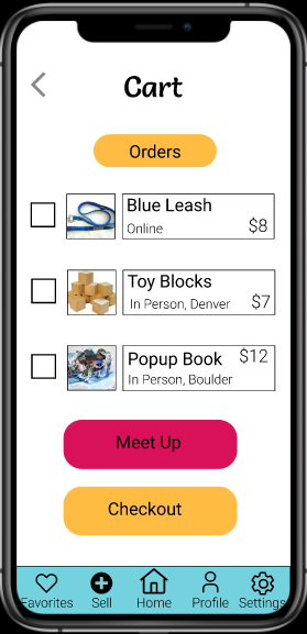
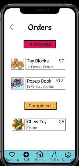
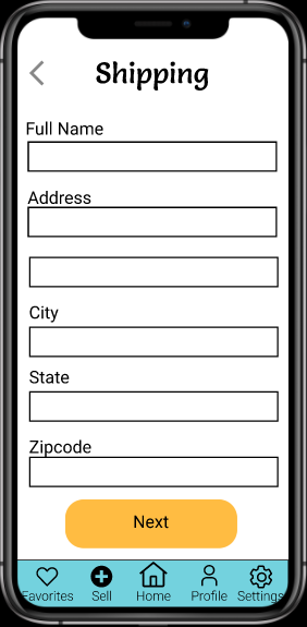
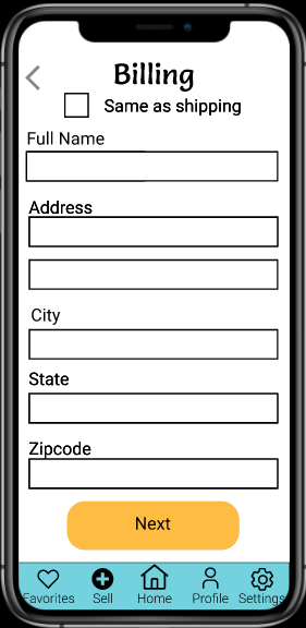
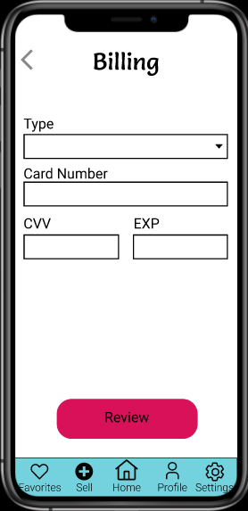
High Fidelity Wireframes:
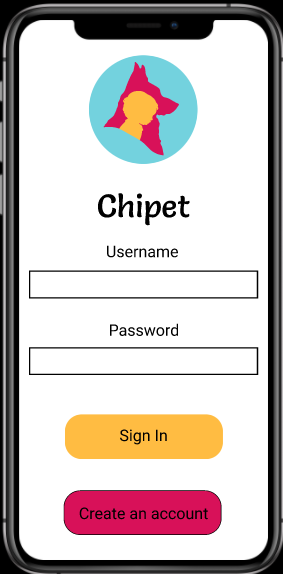
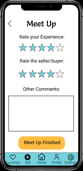
Final Prototype:
https://www.figma.com/proto/TV3CViCvKhnQzszCxZRbQi/UX-Design-1?node-id=3%3A371&scaling=scale-down&page-id=0%3A1&starting-point-node-id=3%3A181
Evaluation and Results:
Design Changes Based on Feedback:
I was sick with the flu on the day when we got feedback from our classmates on our wireframes, but I received some excellent corrections from our Co-Professor, Brittney Urich.
Some Corrections:
~ Consider using full name instead or first and last (some people have long names that cannot fit in small boxes)
~"Create an account" rather than "New user"
~Add labels to navigation icons
~Use radio buttons for sorting (can't sort price high to low and low to high at same time)
Reflection:
Conclusion:
Before this project I knew almost nothing about UX design or the really detailed process involved. Through this experience I got to learn interview techniques, how to evaluate data through mapping, how to create a solution to a defined problem, and the various types of wireframing.
Through this process I also got to experiment with the program Figma. I had always heard about Figma but never actually used it.
Overall, I came away with a lot of new skills that I can now further improve upon, especially in regard to future UX projects.
Future Plans:
This was my first UX project and first time using Figma, so I feel that I could improve on overall designs and interactions. I would like to include scrolling and fillers to give my prototype a more realistic view.
I did not have to time to create every single page within my app. In my next iteration, I would love to create pages for the settings, profile, selling, and favorites.
I was also having a few issues with getting some of my text to display within the interactive prototype; I would like to look at this further.
Updates:
After presenting my final project, I went through and did some more edits. I added in variants to the sign in and sign-up pages to provide further interaction.
I also solved my issue of certain text pieces not appearing within the interactive prototype.
My next edits after this class is over are to add in more text variants and to figure how to incorporate variants for buttons and check boxes. From there I hope to fully build out the rest of the missing pages and add scrolling abilities to create a full app experience.